Properties menu
Style your components and HTML
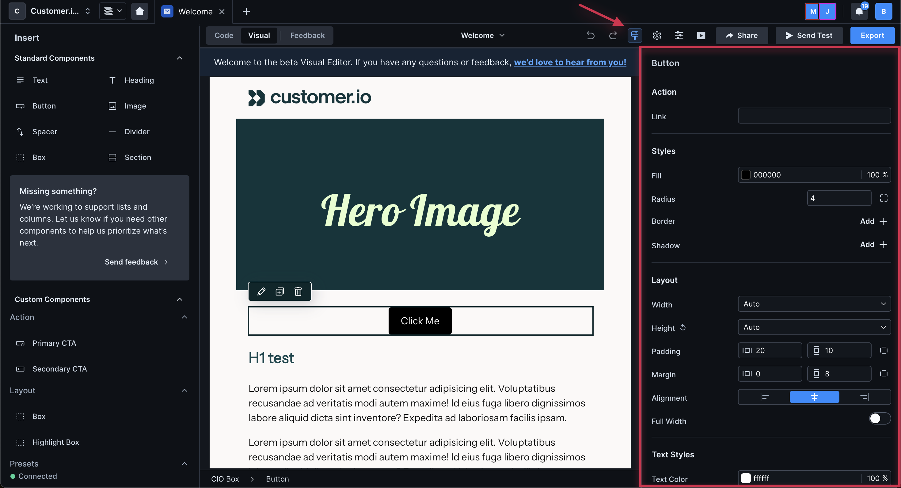
The properties menu is on the right of the canvas. You can open and close it by clicking the paint brush icon.
You can also access it by selecting a component or HTML element on the canvas then clicking the pencil icon.
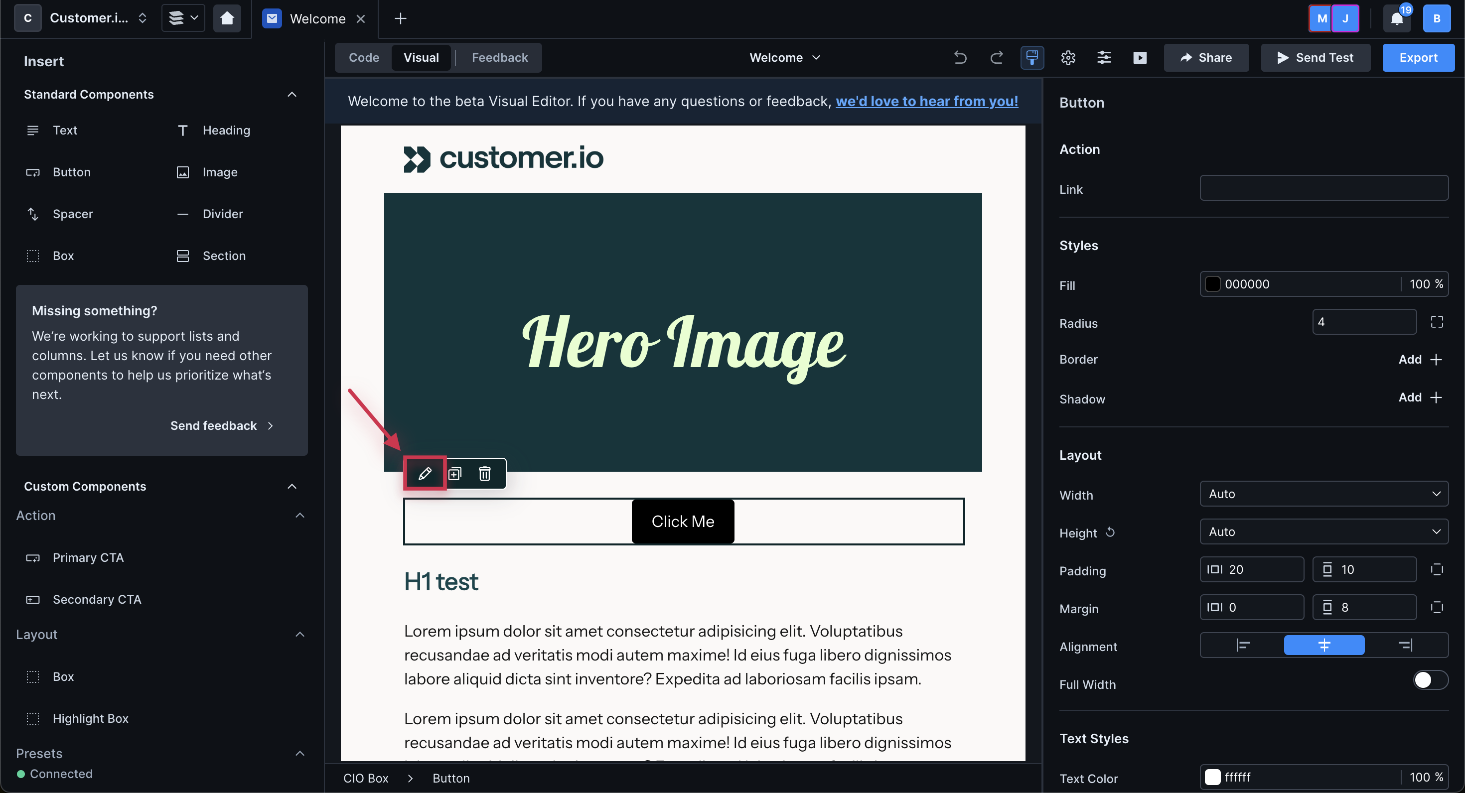
A bubble menu will appear of attributes you can modify. Click More properties to open the right hand panel and view all available attributes.
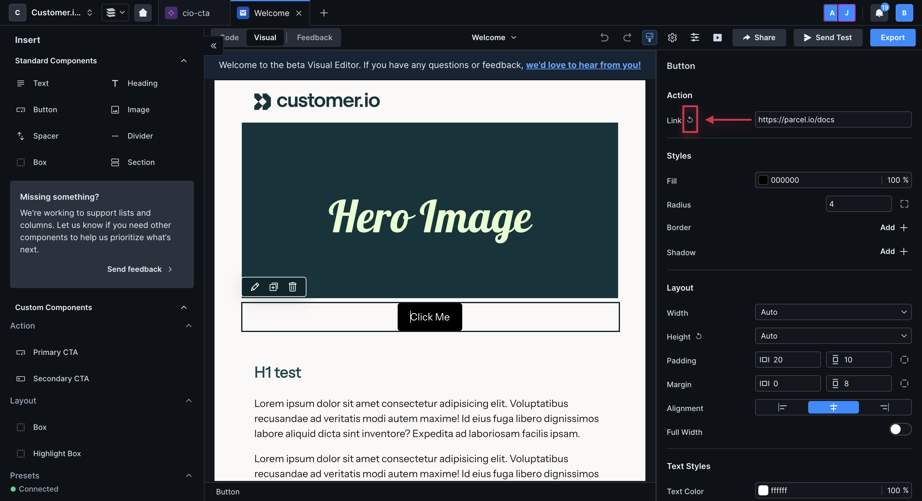
Click the counter-clockwise arrow icon to reset any attribute to its default value.
From the properties menu, you can set the background of a custom component, standard component, or HTML element.
- For a custom component, you'll need to set a property with type
backgroundso you can modify the background in the properties menu. - For a standard component, you can modify the background of boxes, columns, and sections. You can also modify the background of your base component through message settings.
- For an HTML element, you'll have to use
backgroundunder Advanced > CSS style. You'll have to add CSS directly and should check that your code does not break across email clients.
For any of these, you can set a background image, gradient, or solid color.
To set a solid, background color for a component:
- Click the component you want to modify.
- Under Styles, locate the Background or Fill field. Enter the hex value of the color and the opacity percentage or click the preview icon to choose a color and opacity.
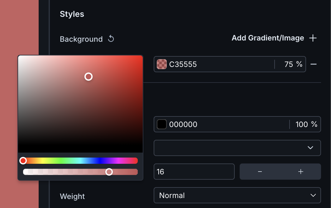
Set the background color of a component. - Preview your changes in the visual editor and send a test to see how it renders in your email client.
To reset your background color, click the subtraction icon to the right of the field.
To set an image as the background of your component:
- Click the component you want to modify.
- Under Styles, locate the Background or Fill field. Set a fallback color in case your customers' email clients do not support images.
- Click Add Gradient/Image.
- Click the new field then choose Image from the pop-up.
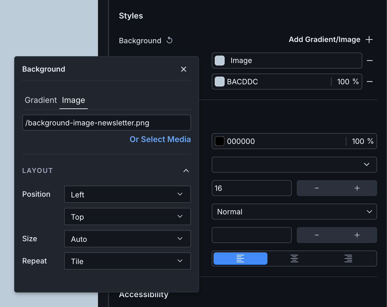
The pop-up where you add your image and set layout properties - Paste the image URL if hosted outside Parcel or choose "Select Media" and browse for a file in your workspace. Keep in mind, when you officially send this email, you must host these images outside of Parcel.
- Modify the layout properties as you see fit. You can change the position, size and repeat of the background image.
- Preview your changes in the visual editor and send a test to see how it renders in your email client.
To remove the background image, click the subtraction icon to the right of the field.
To set a gradient as the background of your component:
- Click the component you want to modify.
- Under Styles, locate the Background or Fill field. Set a fallback color in case your customers' email clients do not support gradients.
- Click Add Gradient/Image.
- Click the new field and you'll see that by default, we set a linear gradient based on your background color.
- To change the gradient to radial and access other settings, click the icon beside the gradient in the pop-up.
- You can also set layout properties. Modify the size then specify how you want the gradient to repeat or how you want to position it in the background.
- Preview your changes in the visual editor and send a test to see how it renders in your email client.
To remove the gradient, click the subtraction icon to the right of the field.
We do not support conic gradients.
To access gradient settings, click the gradient in the properties menu then select the gradient preview.
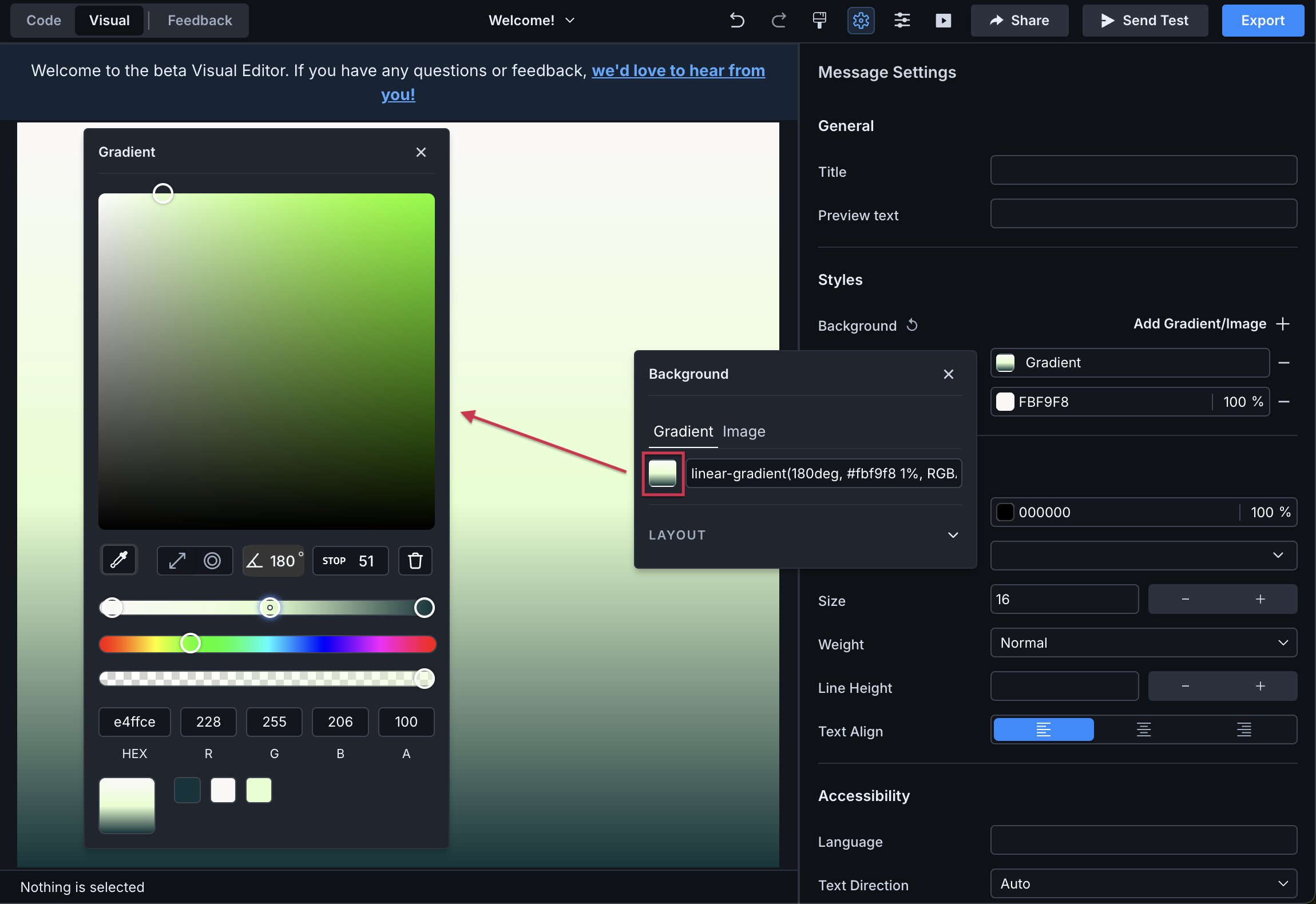
Use the eyedropper to identify a color not in your email yet. Any color in use in your email will appear at the bottom of the gradient pop-up.
By default, we set a linear gradient. You can change the angle of the gradient by typing a different degree (0-360).
You can also switch to a radial gradient by clicking the radial icon.
Add color stops by clicking a location on the top slider. While selected, choose an existing color from the bottom or type in the hex or rgba value.
Alternatively, you can choose a color from the second slider then change the shade up top. Adjust the opacity as you see fit on the bottom slider.
Click the trash icon to delete the selected stop.
If you're setting a background on your message or component, set a solid color as a fallback. Not all email clients support gradients and background images, but they do solid colors. You can find out more about email client support at Can I Email.
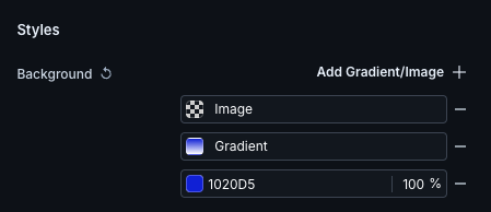
Also note, your background settings are evaluated from top to bottom. In the example above, if the email client doesn't support multiple, layered backgrounds or if it doesn't support gradients, then we will provide a fallback of the image over the solid, background color. If images aren't supported either, then just the solid color background will render. You can change the order by clicking the arrows to the left of the items.
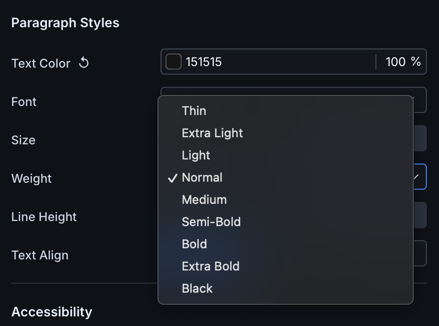
You can set specific fonts or choose from Global Styles. Note that not all fonts support our list of font weights. If we don't support the selected weight, you'll see the next closest one.
We've added a hide attribute to standard components so you don't have to write @media queries to define basic screen breaks and when to show/hide content. This attribute works for all email clients that support @media queries, in addition to Thunderbird. By default, none of your email is hidden.
In the visual editor, click a standard component - like a section or image - to open the properties menu. Then locate the Hide on property.
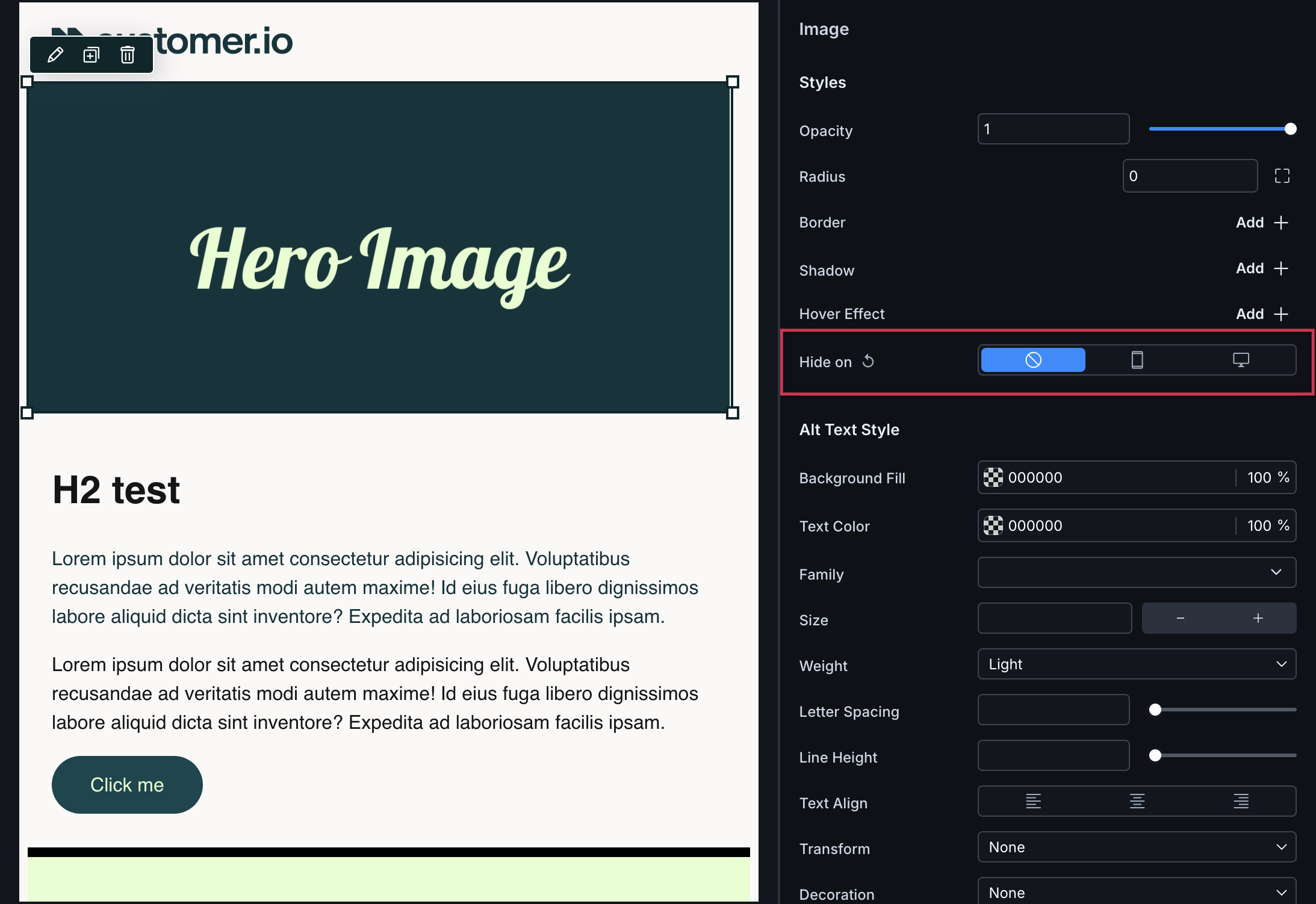
- Select the mobile icon if you want the component hidden on screens less than or equal to 600px wide. In the code editor, you'll see
hide="small". - Select the desktop icon if you want the component hidden on screens greater than 600px wide. In the code editor, you'll see
hide="medium". - Make no selection if nothing should be hidden across devices and/or if you want to rely on custom code.
For most email clients that don't support @media queries, your emails will fallback to what you defined should be hidden on mobile. In the case of Outlook, your emails will fallback to the desktop version.
If you have HTML tags within a standard component, those tags will inherit the hide attribute of its parents.
For custom components, use @media queries to define screen breaks. For Thunderbird, which doesn't support these queries, use our media attribute within an isolated <style> tag.