Add standard components to save time coding emails.
You can add one or more standard components through the visual or code editor. In the visual editor, drag and drop a standard component from the Insert menu onto your canvas. In the code editor, type x- and you'll see a list of available standard components. Choose the one that meets your needs.
In the visual editor, a heading tag is dragged from the left onto the canvas in the middle of the screen. The cursor clicks the heading component then types "Welcome to Parcel!" The cursor moves above the canvas and selects "code" to change to the code editor. On the code editor, an x-heading-2 tag is nested within an x-section tag which is nested within an x-base tag. At the end of the x-heading-2 tag, the cursor clicks then types x- which reveals a menu of standard components. The user scrolls to x-paragraph, clicks it, and closes the tag by typing >. Within the paragraph tag, the words "Check out our documentation" are written. The cursor moves above the code editor and clicks "visual" to change back to the visual editor where you see the heading and paragraph display.
Screen recording that shows creating an email from scratch using standard components.
Style a standard component
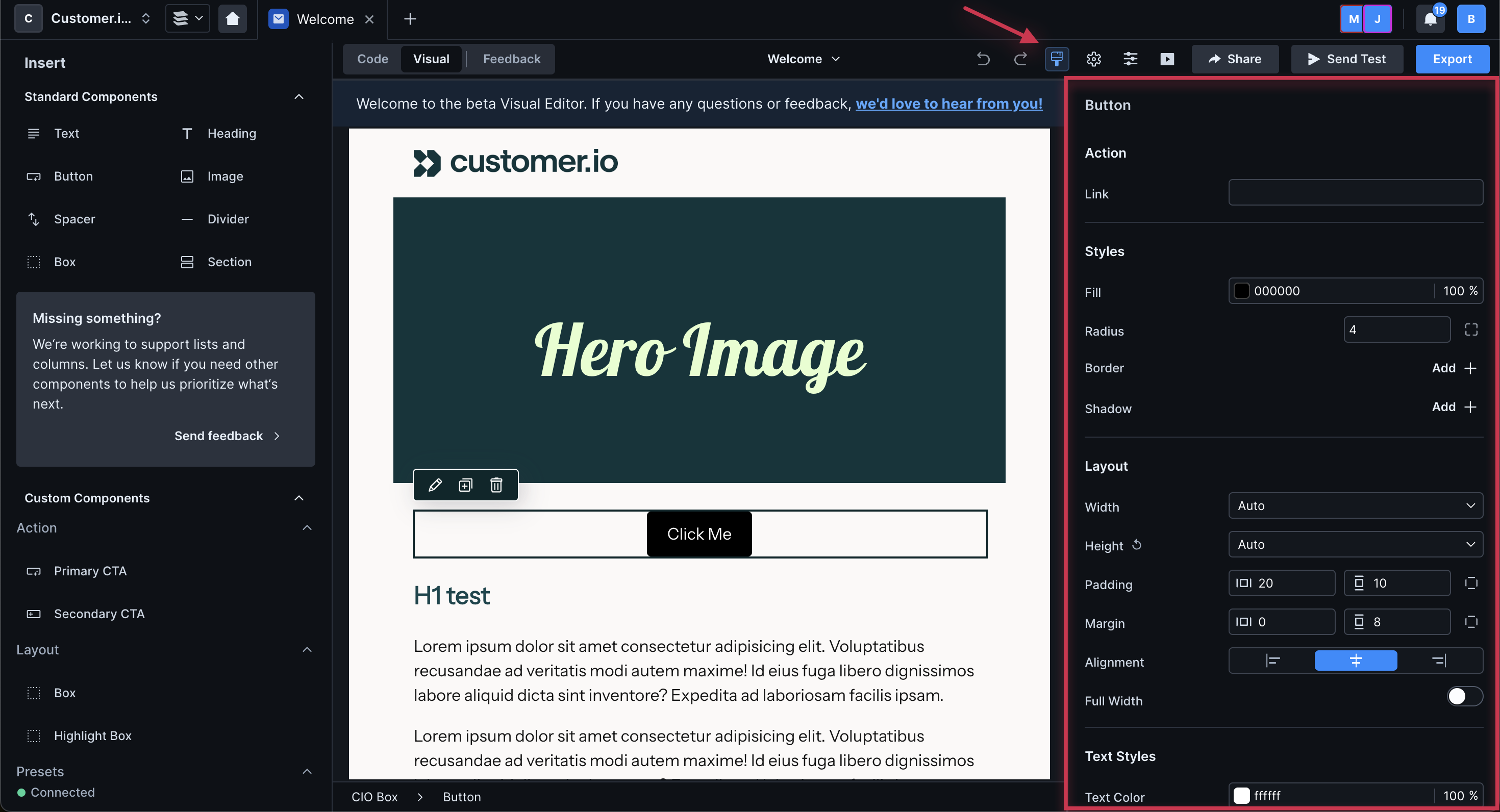
To style a standard component, use the properties menu of the visual editor or add attributes directly to in the code editor.
In the visual editor, select the component then click the pencil icon. You will see a right-hand panel where you can adjust settings and styles as you see fit. Changes are saved automatically.