Insert menu
Add standard or custom components to your email
To the left of the Visual Editor, you'll find the Insert menu which contains a list of components you can drag/drop onto the canvas. At the top is a list of Standard Components - a library of out-of-the-box elements to help you get started right away. Below that is a list of Custom Components - those you've coded from scratch.
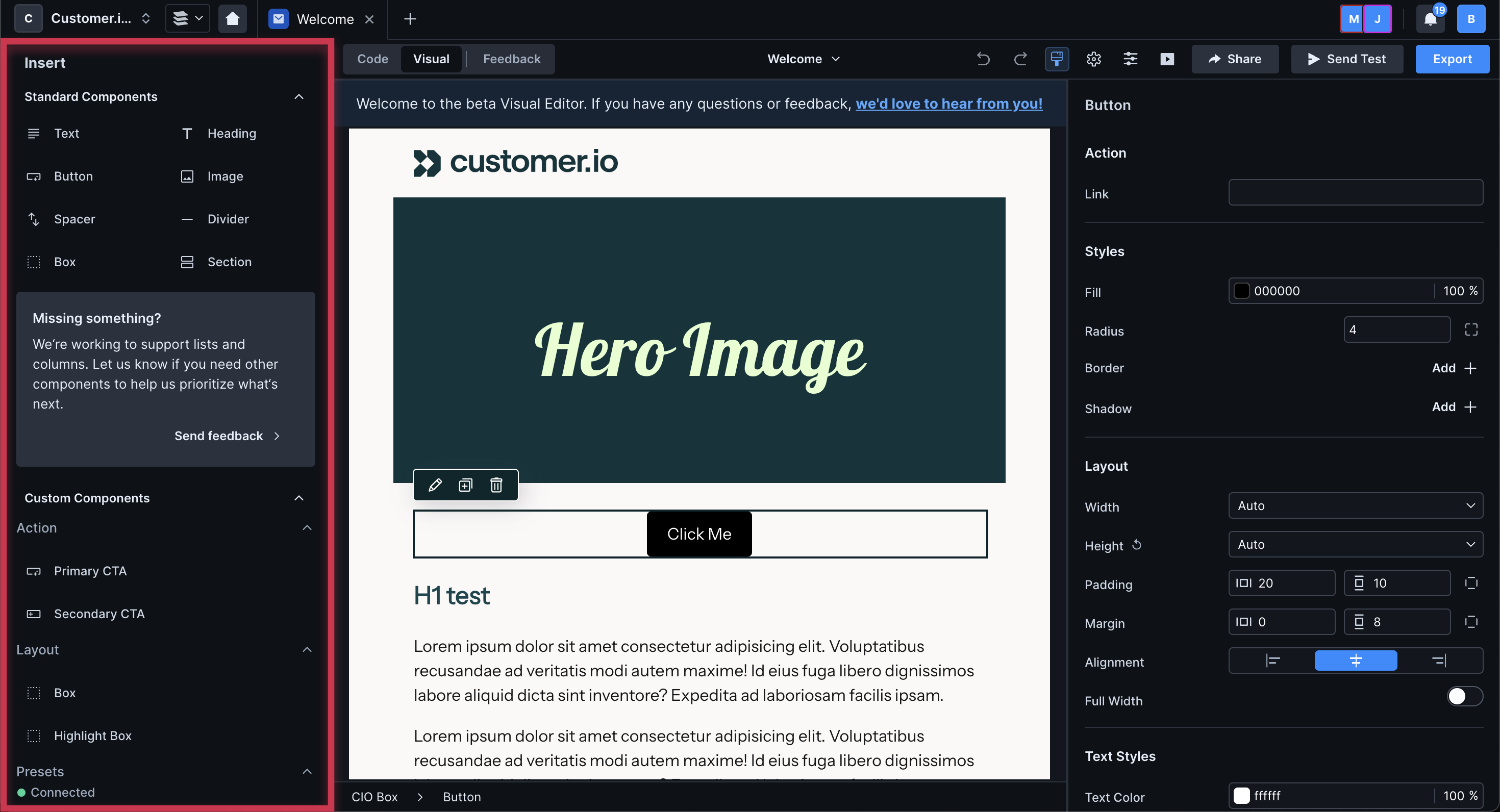
You can expand and collapse the menu at the top. You can also resize it by dragging the right border.
You can insert any of our standard components through the menu of the visual editor.
After you insert an image component, you can drag and drop an image onto the component in the canvas or click Choose to view your Asset library.
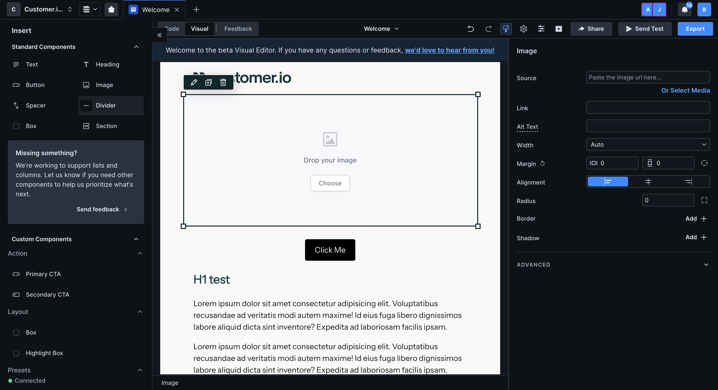
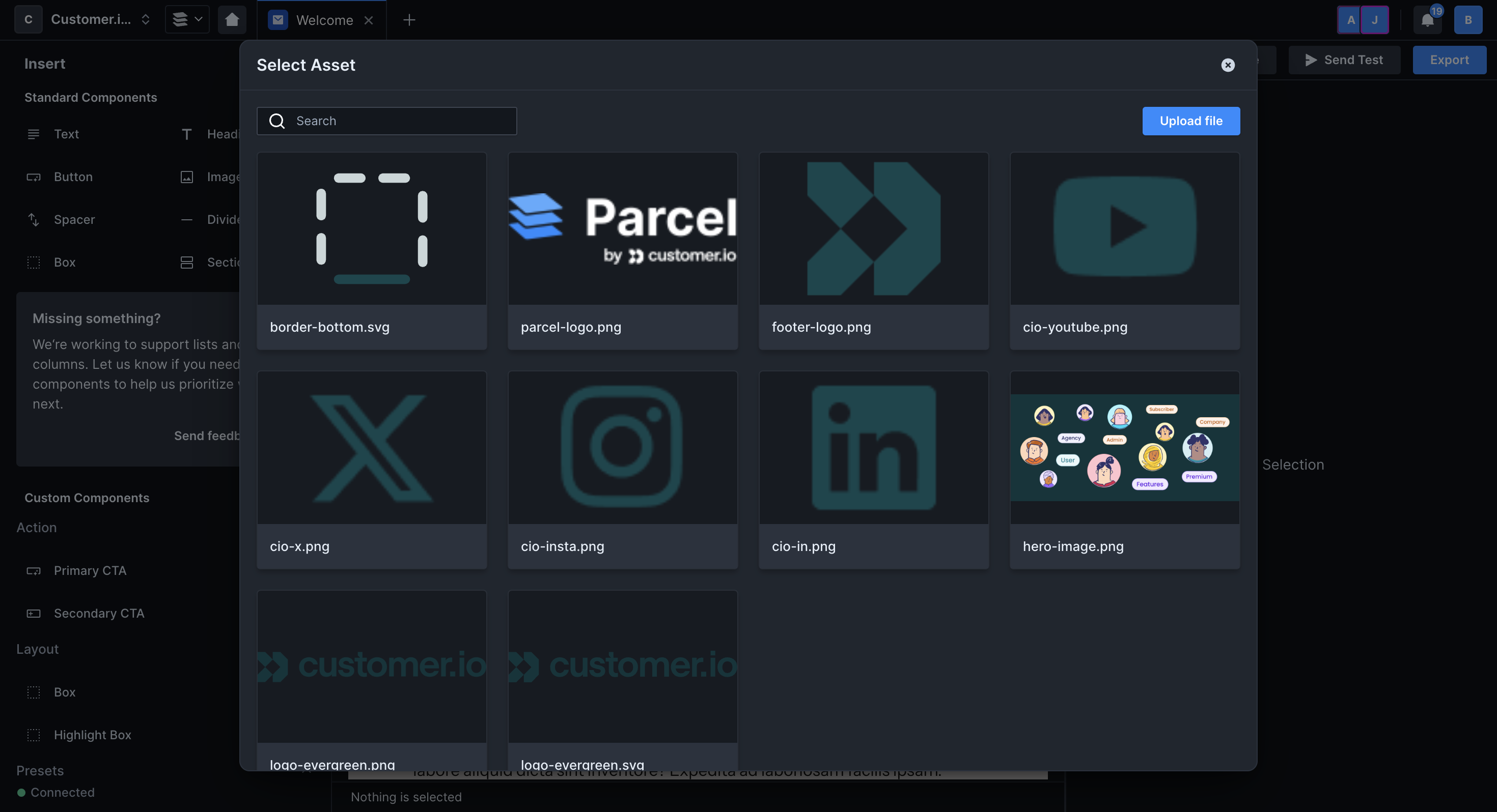
If you click Choose, you'll see a grid view of all images you've uploaded to your workspace. Select one or click Upload file in the top right.
Images must be smaller than 3MB. If you export the email, it will come with a zip file of images.
If you move an image file into or out of a folder, you will need to manually update the path!
You can insert custom components created in your workspace through the menu of the visual editor.
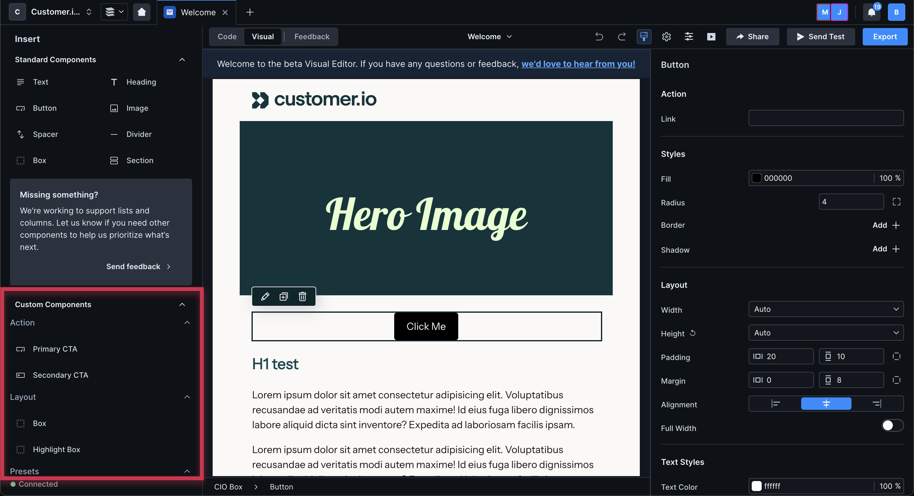
If you have a lot, categorize them so that they're easier to find in the insert menu. Above, you can see three categories: Action, Layout, and Presets.
To categorize them, add a section to the component's <script> tag. For instance, here's the JavaScript for the custom components titled Primary and Secondary CTA in the image above:
export const config = {
  label: 'CIO CTA',
  presets: [
    {
      icon: 'smart_button',
      section: 'Action',
      label: 'Primary CTA',
      content: '<cio-cta></cio-cta>',
    },
    {
      icon: 'buttons_alt',
      section: 'Action',
      label: 'Secondary CTA',
      content: '<cio-cta variant="secondary"></cio-cta>',
    },
  ],
};