Insert custom components
Insert a custom component into one more emails.
After you create your custom component, you can insert it into one or more emails then style it as you see fit.
Open your email, go to the Code editor, then add your component's tag, which follows this format: <component-name></component-name>.
You can add style attributes in the code editor.
You can set properties in the visual editor, without touching code.
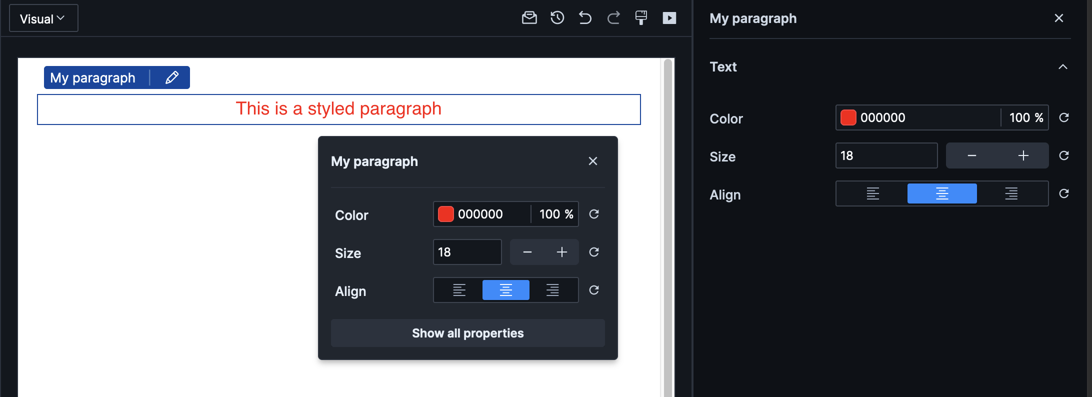
On the main properties menu, you'll also see the properties broken down by type. In our example, we have one type, Text visible at the top.
You can add properties directly to the component using attributes.
<my-paragraph color="red" text-align="center" #set:font-size="18">
	This is a styled paragraph
</my-paragraph>
Note how font-size is set using #set:. This prefix is needed on certain properties depending on the schema settings used. Use #set: to pass in a value that’s not a string, like a number or boolean. The shorthand is just a colon: :font-size=“18”.