Visual editor
Where you create emails from visual blocks
Welcome to Parcel's new email design system! We've made collaborating across teams easier than ever. Now, engineers can code components and let marketers visually design emails based on these components - no need for marketers to code themselves!
In the Visual Editor, you can drag-and-drop components onto a canvas to build your email. Utilize the components coded by your team members and/or craft an email from our library of standard, out-of-the-box components!
Send us feedback anytime! We'd love to hear from you.
Note, multiple people can work within the code editor at the same time, but not the visual editor. In the visual editor, we only allow one person to make changes at a time. If one team member is in the code editor while another is in the visual editor of a single email, no one can edit until one of you leaves. You'll see, "The file is currently being edited by user's name," until then.
To get the most out of the Visual Editor, make sure you're using our next generation of components. Any workspace created on or after April 23, 2024 already supports them. For all other workspaces, you'll need to upgrade manually. Check out How to upgrade and review Custom vs legacy components to make sure you're ready!
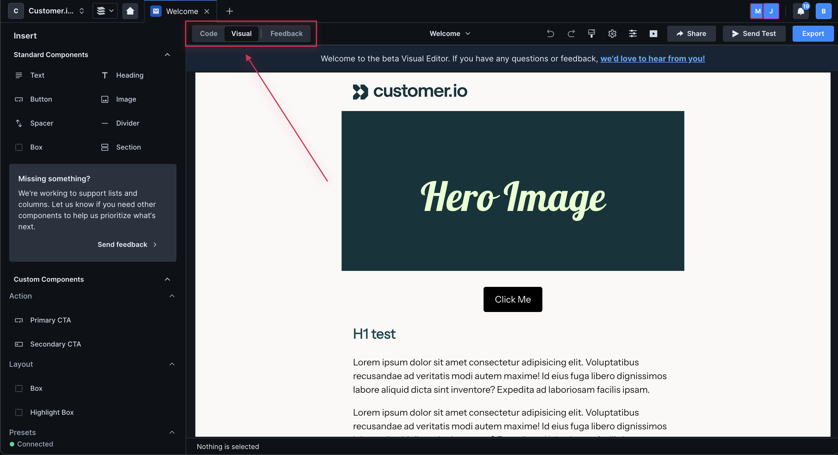
Select an email then click Visual in the top left to navigate to the Visual Editor.
The visual editor is broken down into three areas:
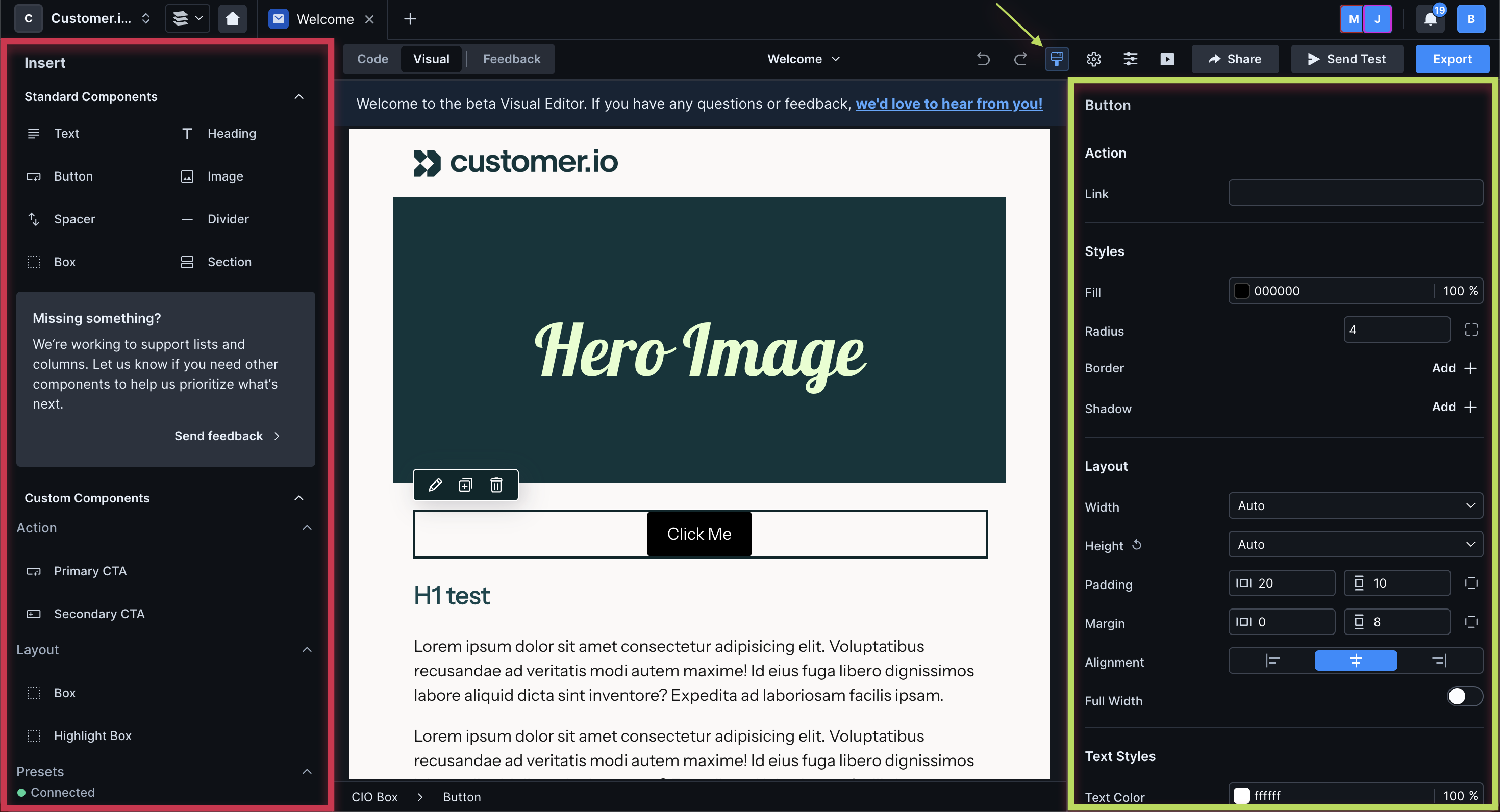
- Insert menu - highlighted in red above, a menu of standard and custom components on the left of the editor. Drag these components onto the canvas to create an email.
- Canvas - in the middle of the editor, where you drag and drop components and edit their styles and content.
- Properties menu - highlighted in green above, a menu of attributes you can set on a selected component. Click the paint brush icon to open/close the panel.
To the right of the properties menu icon, you'll see a gear icon. Click this to view Message settings and set attributes on your base component.