Guide to components
Components are a way to organize your code in reusable blocks and keep your Parcel HTML editing experience clean. Unlike snippets, when you change the component file, it will change in all places it has been used.
Components are fantastic for pre-saved blocks of code that infrequently need changing, compare to snippets that may have aspects inside of them that will frequently change (think, CTA buttons that often will change their call to action). Regarding components, think about a standard email footer that may only need its copyright date updated once a year or an email header with a brand logo.
Different from snippets, when referenced within emails, components don’t expand. So what may be 50 lines of code within the component view, when referenced in your email, the only thing you will see is the name of the referenced component. Upon export, the component will expand.
Components are workspace specific, unlike snippets that will live across the entire account. Creating a component works similarly to creating a new email or asset.
Next to Workspace, click + to open up a new component.
Bring in your component to any email by opening a tag and typing out the name of your component. Your component tag will automatically close, and your component material will pull into your email.
Once the component is in your email, you can quickly jump back into it by CMD /CTRL + Click on the component, which will return you to the component source code.
- A standard email footer. Let’s face it, your email footer is probably rarely updated. Until the clock strikes midnight on New Year's Eve, and all of a sudden, every single copyright date needs to be updated. What if all you had to do was update it in one location? That’s the beauty of components. If you update it in one location, it’s updated across all emails that reference it.
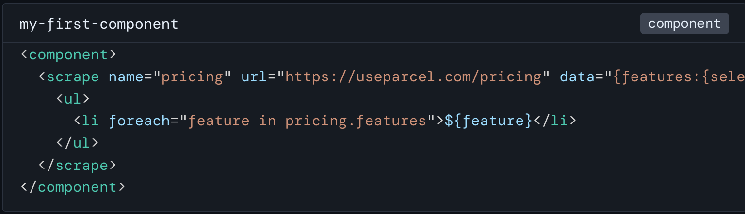
- Scraping web pages. Let’s think of a website that features daily cat facts. And specifically the scenario that you own a pet store. Once a week, you send an email with the latest inventory updates, pet health tips, and a fun cat fact. Instead of manually pulling the cat fact within your email, you can create a component that actually fetches the daily cat fact at the moment the email is sent. This is done by creating a component that includes the URL of the daily cat facts site and text selector.
- Button. If you’ve read our Guide to snippets, you may remember that buttons can also be created as snippets if you frequently find yourself changing the link or copy. But if you have standard buttons used throughout your organization, creating them as components allows you to reference them on-demand within your emails quickly. Think about standard buttons that won’t ever change, such as “Contact Us” which links out to your customer support team, or an “Upgrade Now” button that drives to your paywall. Perhaps you have a standard “Login” page? Why not go all out and create a button repository using components!
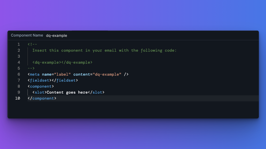
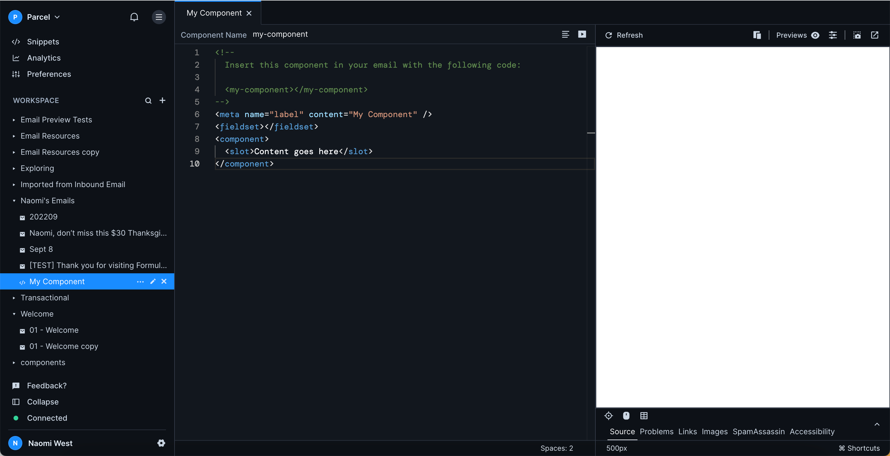
In the above example, you'll see that a new component comprises a few lines, where you'll begin to input your information.
<!--
  Insert this component in your email with the following code:

  <dq-example></dq-example>
-->
<meta name="label" content="dq-example" />
<fieldset></fieldset>
<component>
  <slot>Content goes here</slot>
</component>
Comparing to the above, to call on the component in your email, you'll insert it with <dq-example></dq-example>.
The <fieldset></fieldset> is where you can insert attributes, allowing you to customize the component once in the email. A great use case for this, is if you have a standard CTA button component but need to customize the href on a per-email basis.
In this case, inputs can be considered "attributes" related to your component and can range not only from hrefs but also to colors, background colors, and more!
Within your <slot></slot>, you'll see "content goes here." This is a placeholder for whatever content you plan to add in your email. If you do not add any content between your button opening and closing tags in your email, you'll continue to see "content goes here" being pulled into the email. However, once you add your content from the email, you'll see that the default placeholder text is now replaced.
Styling of your content, should take place surrounding the <slot></slot> tag, and if we wanted to style our CTA button that we've been reviewing, we could do so with CSS inlining on the <a> tag that will wrap our <slot>.
What component use case do you want to see next?!