Use your email design system with drag-and-drop

We’re excited to introduce drag-and-drop!
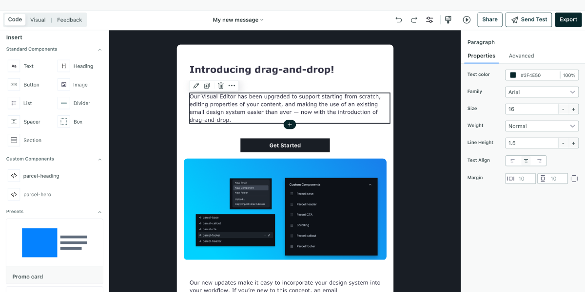
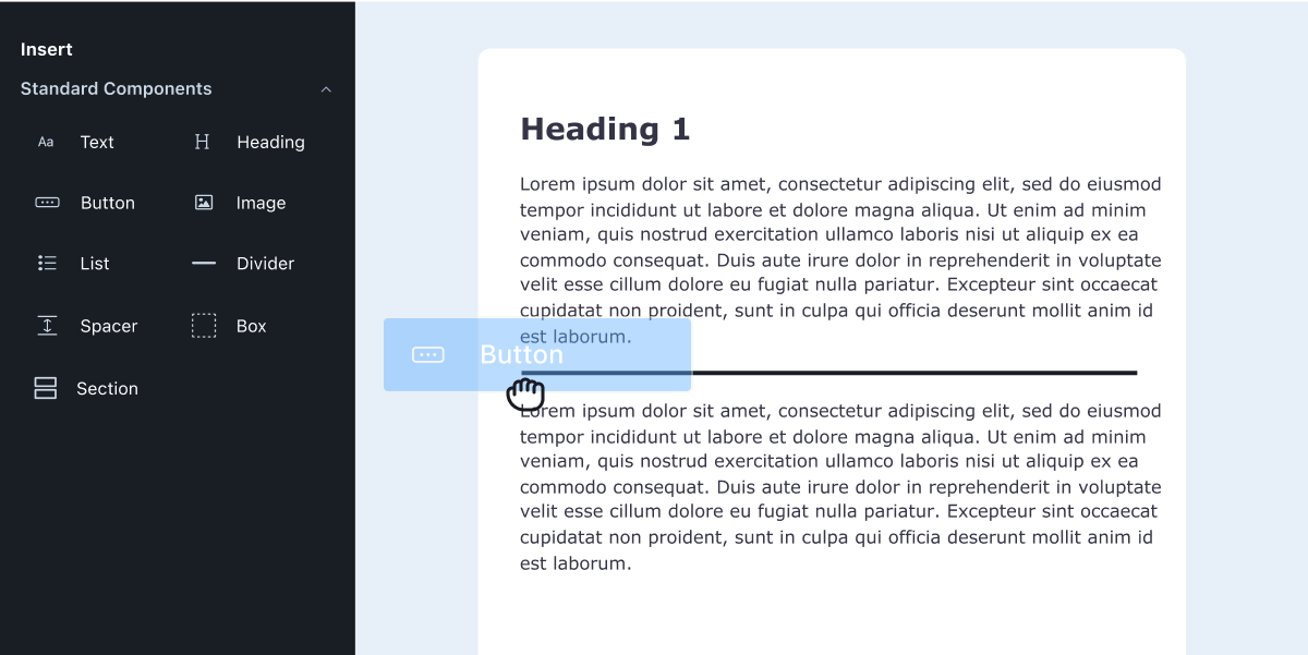
Parcel’s Visual Editor now supports the ability to drag-and-drop components, edit content easily, and create simple emails without overwhelm. For those who prefer a traditional drag-and-drop editor but want their emails to pack a punch of on-brand, robust code, you can take a sigh of relief! With these new updates, you can use powerful yet familiar tools to create and edit your emails. Perfect for leveraging an existing email design system in a straightforward environment.

Let’s take a look at what this latest release covers.
The introduction of drag-and-drop means that any email creator can use Parcel’s standard components to craft their next email. By focusing on the basics, such as a header, body text, and a button, you can have a customer touch point ready to go in minutes without worrying about breaking code.
For those that do and want to build emails quickly — for example, a text-based transactional email or even something like Parcel’s text-based onboarding emails, you can now do so easily.

Your emails, however, don’t need to end in simplicity (although we do love a simplistic email at Parcel) — because customization is at your fingertips. Again, without worrying about the code.
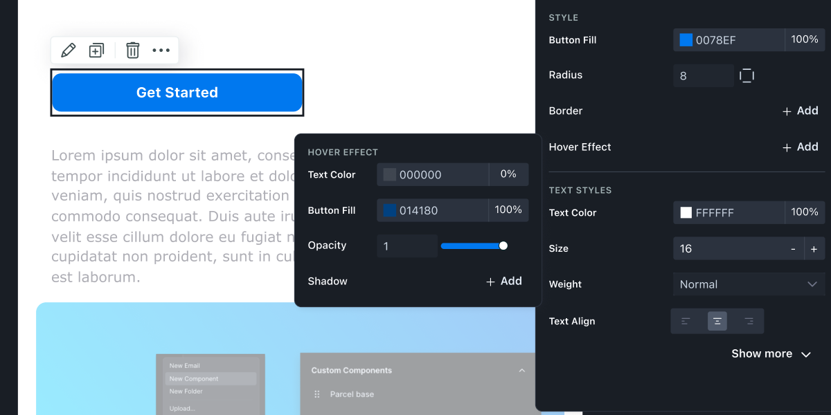
For those that want to make quick edits to copy, links, imagery — we’re excited to announce that the Visual Editor now supports a wider variety of editing opportunities in addition to the basics. Whether it’s taking an existing email template and making copy tweaks ahead of your next newsletter send, or updating styling on all buttons— these options are now at your fingertips with the Visual Editor.
With the introduction of properties, email creators can quickly edit their emails—things like font size, language definition, and adding links. It’s all there!

Editing content in the Visual Editor either requires the use of semantic HTML (ie. using proper HTML tags), or creators can surface editing opportunities for text with the standard component of <x-edit-text> which creators can use to wrap text they want to make editable in code.
But what do all of these updates amount to? They lead us to a world where code, and drag-and-drop can work in tandem. Where developers can easily pass an email file off to a marketer to make copy edits, and each party has an editing environment that works best for them.
Whether you already use an email design system in a tool like Figma for your mockups, have been using one for a while with components in Parcel, or have a handful of pre-built templates saved in your email tool, you’ll be excited to hear about our updates on leveraging a design system! But if you don’t know much about an email design system, let me give you a quick TLDR.
An email design system is a set of guidelines, code, or content that standardizes the creation and maintenance of emails. It ensures consistency, efficiency, scalability, and quality across all email communications and ensures that you use on-brand designs when making changes to your next piece of communication.
Some simple examples of custom components in your email design system could include a base component, a call to action button, a footer, or a header. When updates are made to your component's code, they are reflected in every email that includes said component. Instead of going through emails individually and updating content, you can update your components, and all your templates will reflect the changes you make. From rebrands, to changing copyright dates, to making quick font size adjustments, making simple changes across multiple emails can become incredibly quick.
If you’re already familiar with this concept and have an email design system already in Parcel, you’re most likely already aware of how reusability and efficiency can be so powerful.
Components, the key aspect of an email design system built in Parcel, can now be leveraged in the Visual Editor. Think of components as global content modules, which can easily be dragged, dropped, edited, and moved about from within the Visual Editor. You can now move around different components to build an email as if they were blocks of on-brand Lego. And when combined with the power of properties, teams can now go beyond the basics.

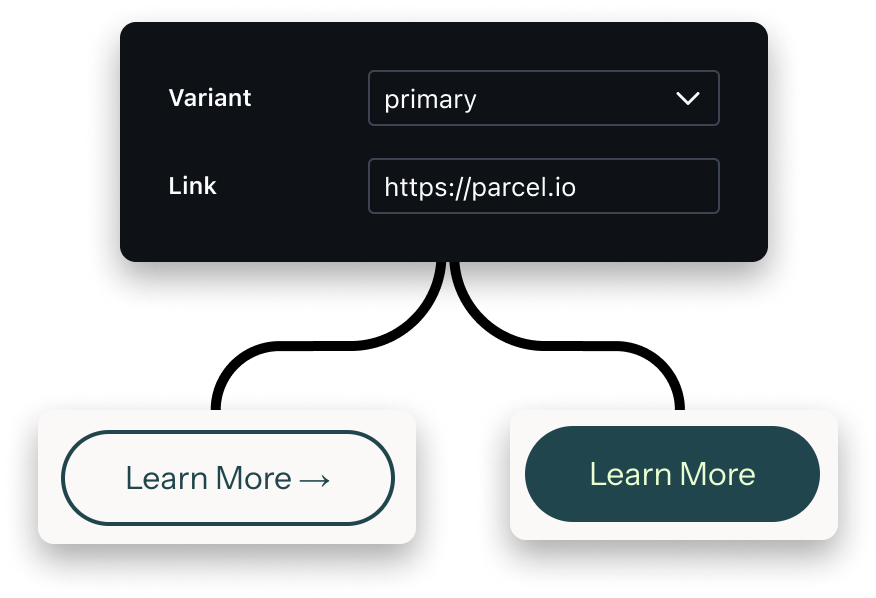
Assigning variants to your components will allow end users to swap between the properties defined in code. Check out this example where we move between a primary and secondary CTA — each including its own specific styling.

Variants can be used for multiple different aspects of your email design system. From different styles of a CTA, to different background colors, to different greetings in the copy!
When creating custom components, as the developer, you get to choose exactly which parts can and can’t be edited in the visual editor. You can also limit things to a list of predefined options to further control the output. Let’s say you have an email footer that you include in every email but don’t want to risk the copy being updated or links being altered — redefining these options in the code, you’ll allow this component to be used in the Visual Editor but not edited.
On a similar note, if you have a CTA button and want both the copy and the link to be edited — but not risk any changes to the styling such as font size, margin, padding, or hover effect — you can granularly control this in your component code.
For developers who have worked tirelessly crafting design systems with modular code, robust component libraries, and templates, we’re excited for this update to now enable your marketers to use those systems with ease. If you’re curious to understand how to prepare your existing components for your marketers to use in the Visual Editor, or want to explore kicking one off from scratch, check out our Guide to Email Design System.
We’re looking forward to seeing how the power of creating emails with ease, editing content quickly, and leveraging email design systems enables teams to work more efficiently with the Visual Editor! As always, send in your feedback—and we can’t wait to hear from you!