Guide to relative units
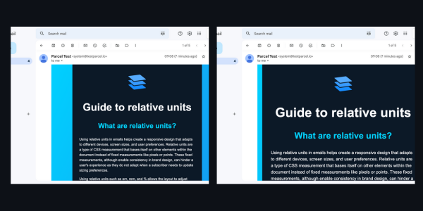
Using relative units in emails helps create a responsive design that adapts to different devices, screen sizes, and user preferences. Relative units are a type of CSS measurement that bases itself on other elements within the document instead of fixed measurements like pixels or points. These fixed measurements, although enable consistency in brand design, can hinder a user's experience as they do not adapt when a subscriber needs to update sizing preferences.
Using relative units such as em, rem, and % allows the layout to adjust based on the screen size of the device being used to view the email. For example, using % for width or height allows the email elements to scale up or down depending on the device viewport size, ensuring that the layout looks great across all devices.
Relative units include:
- rem - the root
font-size(this is editable by the users preferences) - em - the current
font-size - ex - the height of an
xcharacter in the current font - ch - the width of a
0character in the current font.
In short, using relative units helps ensure accessibility for users with different default font sizes or zoom settings on their devices. It allows them to easily adjust the font size and zoom level without causing layout issues or readability problems.
It also allows us to scale up a section of our code to draw attention to it by just changing the font-size. Rather than having to adjust the font-size, line-height, padding, margin, width height individually.
Because email clients can be very inconsistent with their default font sizes and because rem units don’t yet have full support, the first thing we need to do is correct the base font size by wrapping our email code with this style.
<div style="font-size:medium; font-size:max(16px, 1rem)">
</div>
Because the most common default font-size is 16px, we’ll use that as a base to convert our px values into em values. To do that we divide our px value by 16.
-
font-size:16px16 / 16 = 1 becomesfont-size:1em -
font-size:24px24 / 16 = 1.5 becomesfont-size:1.5em -
width:600px600/16 = 37.5 becomeswidth:37.5em
When you change your design to use relative units, it means the breakpoints in your design are relative as well, so make sure also to update your media queries.
To test your code and make sure it’s responding to the users preferred font size, go into your browser settings and change the font size
- Chrome - chrome://settings/appearance
- FireFox - about:preferences#general
- Safari - Option-Command-Plus sign (⌥ ⌘ +), Option-Command-Minus sign (⌥ ⌘ -)
Further recommended reading on rem and em, and their client support.
