Guide to drag-and-drop
In this Guide, we’ll explore how to create an on-brand email campaign with Parcel’s new Visual Editor. Packed with drag-and-drop capabilities we all know and love, but with an extra little bit of customization spice.
Dive into the guide below to take your blank slate to the next level.
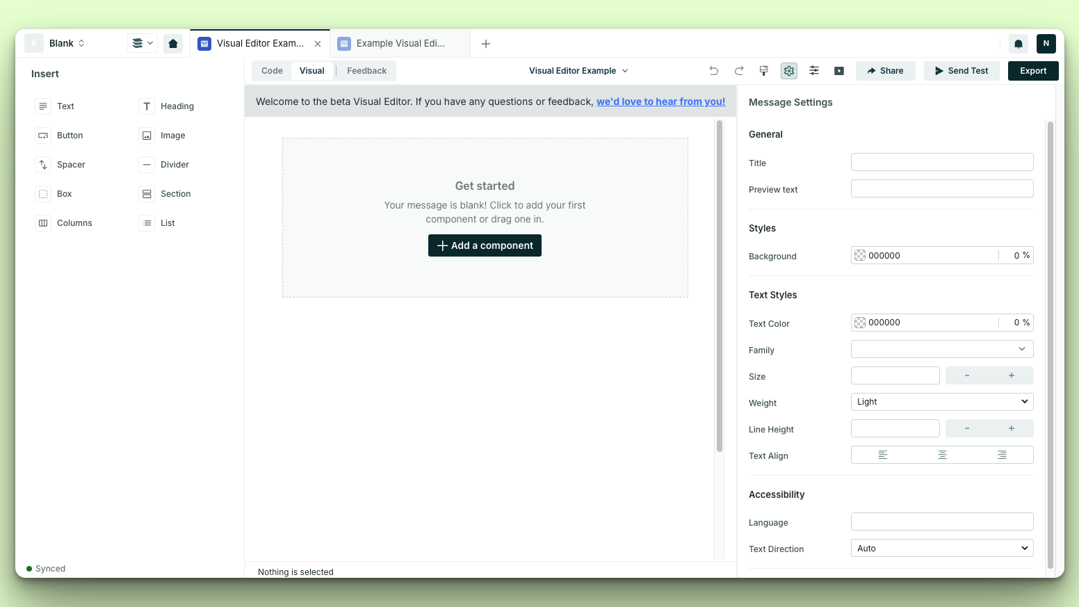
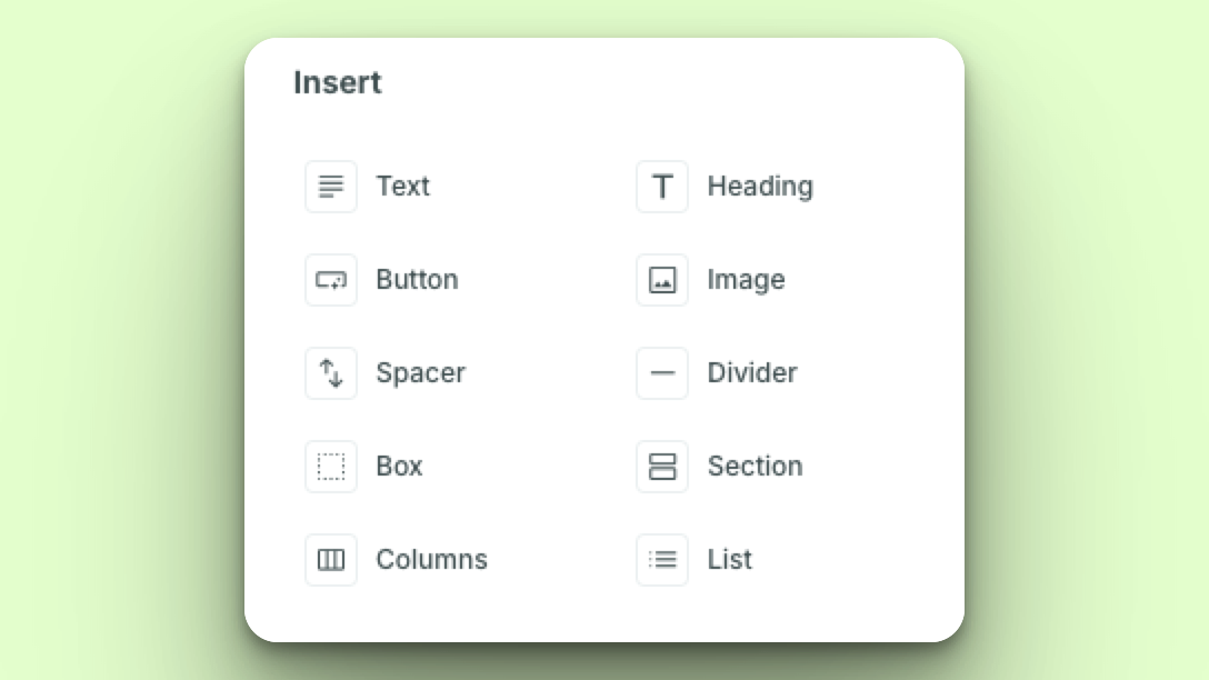
The email world is your oyster with a handful of standard components to start your email with.
The start from scratch state doesn’t need to exist for every email. By using standard components you can cobble together a beautiful email that you can either save as a template, or save portions of it as a component to reuse for future email campaigns.
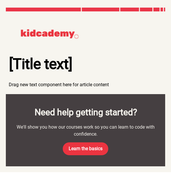
For the sake of this guide, we’ll be working off of a mockup from our designer Khari, to create an onboarding template for our fake brand — Kidcademy.
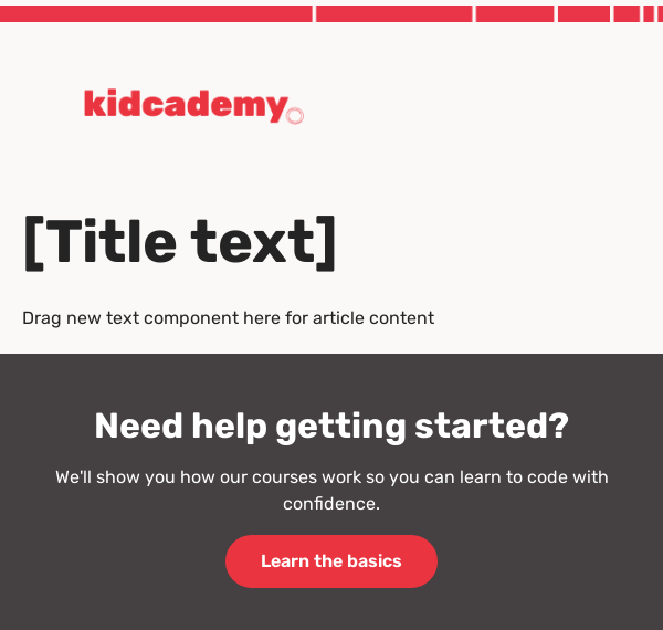
With this design, we need to establish the header with a logo, a basic H1 and paragraph text, and then this “Need help getting started?” to create the template that will help us scale. Let’s get started!
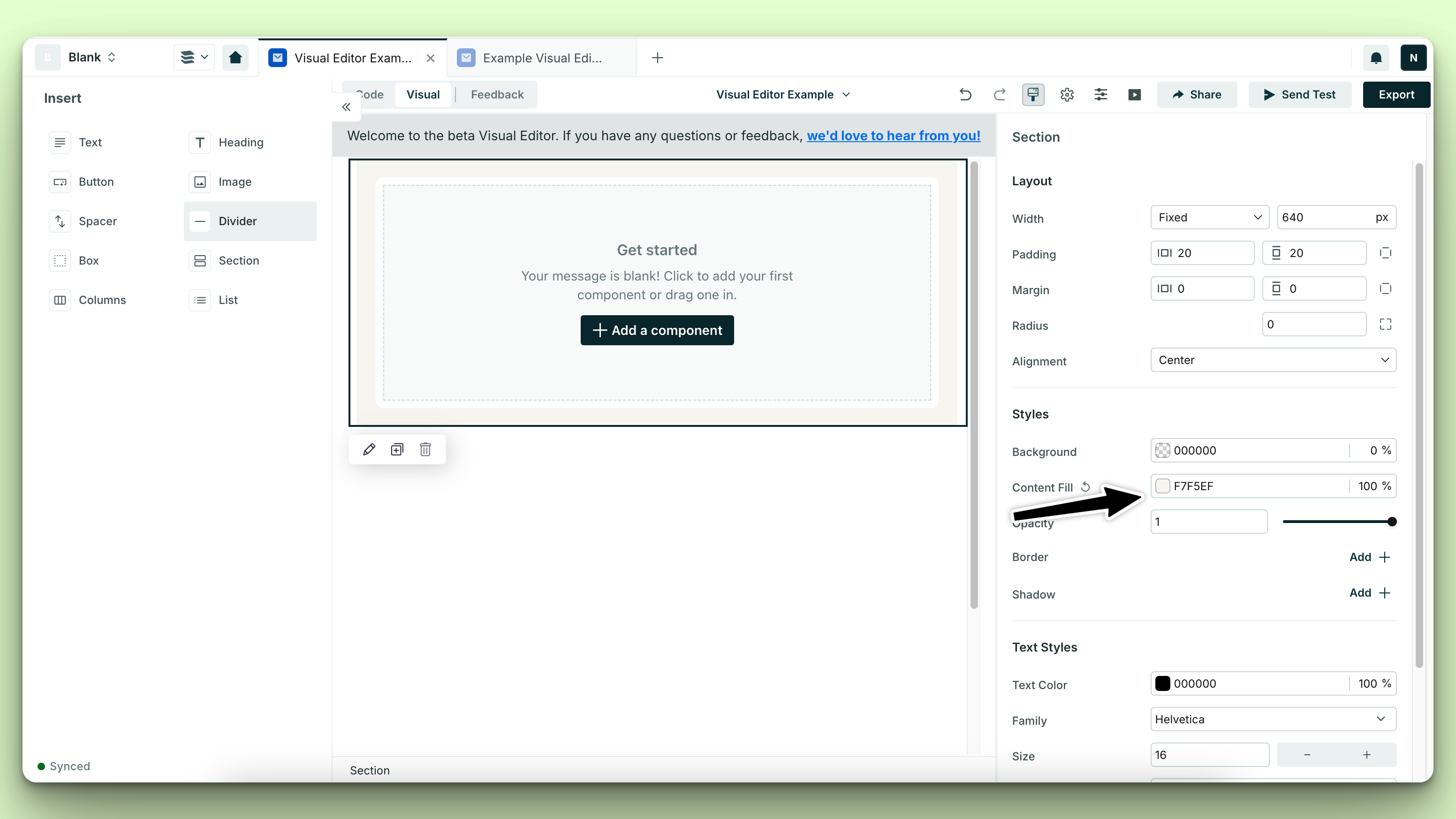
Starting with the foundations — I’m going to start by setting my email’s content color — which in my design is a HEX value of #f7f5ef.
Then, I’ll drag in my content pieces to create the skeleton of the email design I’ve been provided.
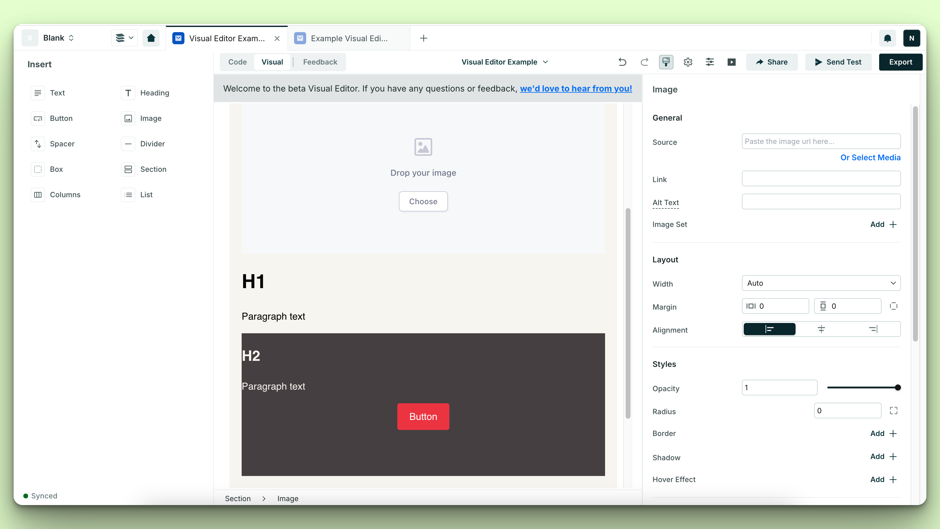
Here’s the standard components I stacked to get the above layout:
- Image
- Heading —> Heading 1
- Text
- Box — where I updated the box fill to the design’s HEX value of
#453f41and then stacked further standard components inside the box as:- Heading —> Heading 2
- Text
- Button
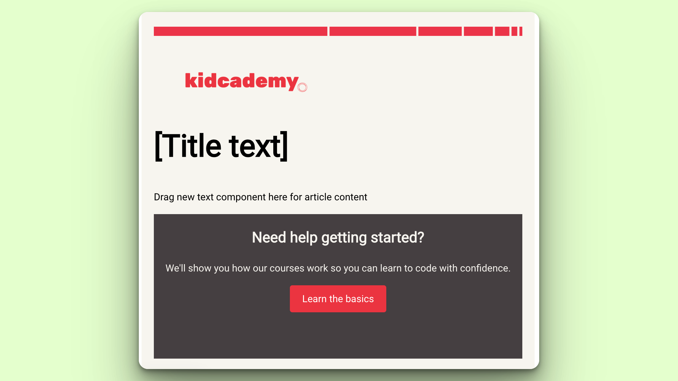
Looks good! Right? Not really, but we still have a way to go.
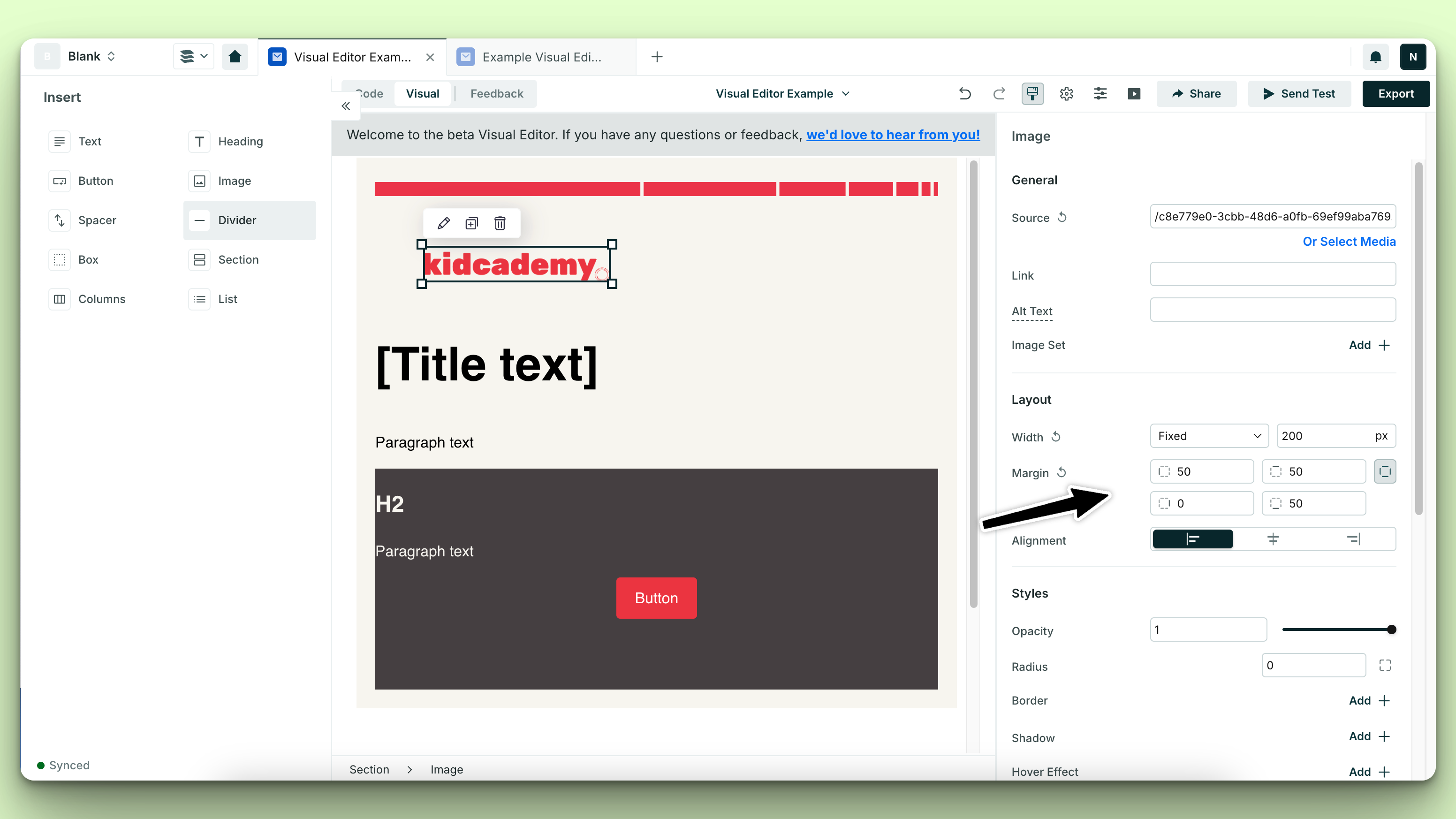
I first started tackling updating the margin on my logo. In my design, I have margins on the left, top, and bottom of my image.
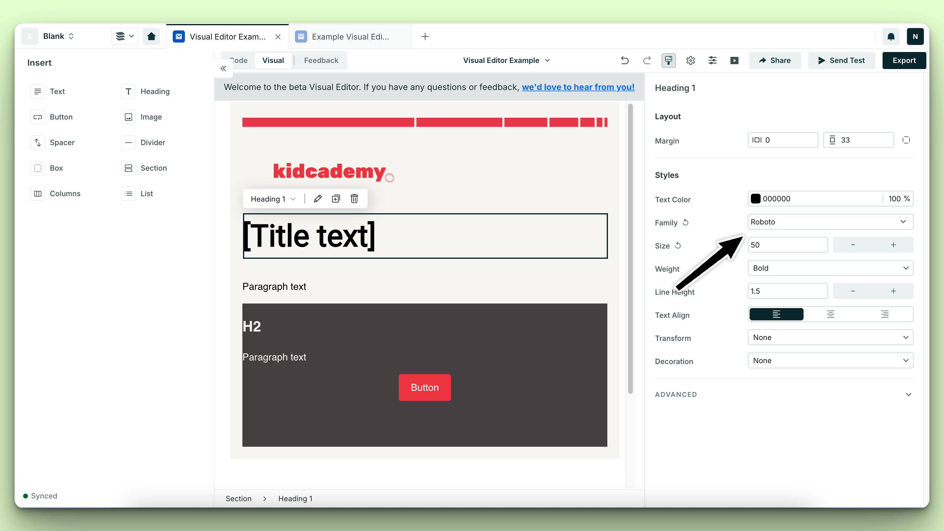
My next task is to increase my H1 font size and update the font family to Roboto. Now that I know my font size for my H1 needs to be larger and that the font family for my email should be Roboto, I can update the font family for all other text standard components as well.
We’re starting to get there. We’ve added in the placeholder text. But, we’ll notice we still need to round the corners on our button, and increase the margin on some of our next so it’s not so nested against the container borders.
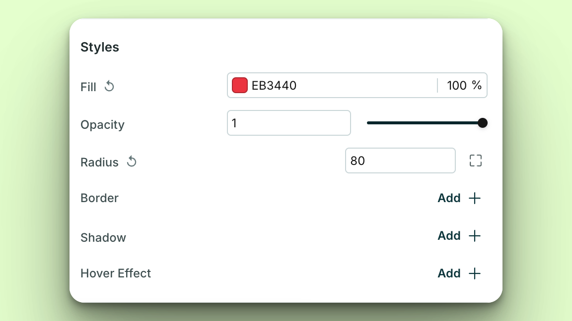
I changed the button radius from 4, to 80 to get a rounded effect:
Things are looking much better!
Now that are emails are in a place where they could scale, how do we save this template, and some of the content inside of it to make it more scalable?
To mark an email as a template, select the dropdown from your file name and hit “Mark as Template” — voila!

But what if I want to save a piece of content so I can use it easily in my next email? Let’s save content as a component! We’ll need to put our technical hat on, but trust me it’s easier than it seems.
I’m making the assumption that I might want to reuse the “Need help getting started” content box in multiple emails, so I’d like to save it as a component so I don’t need to recreate it for every email.
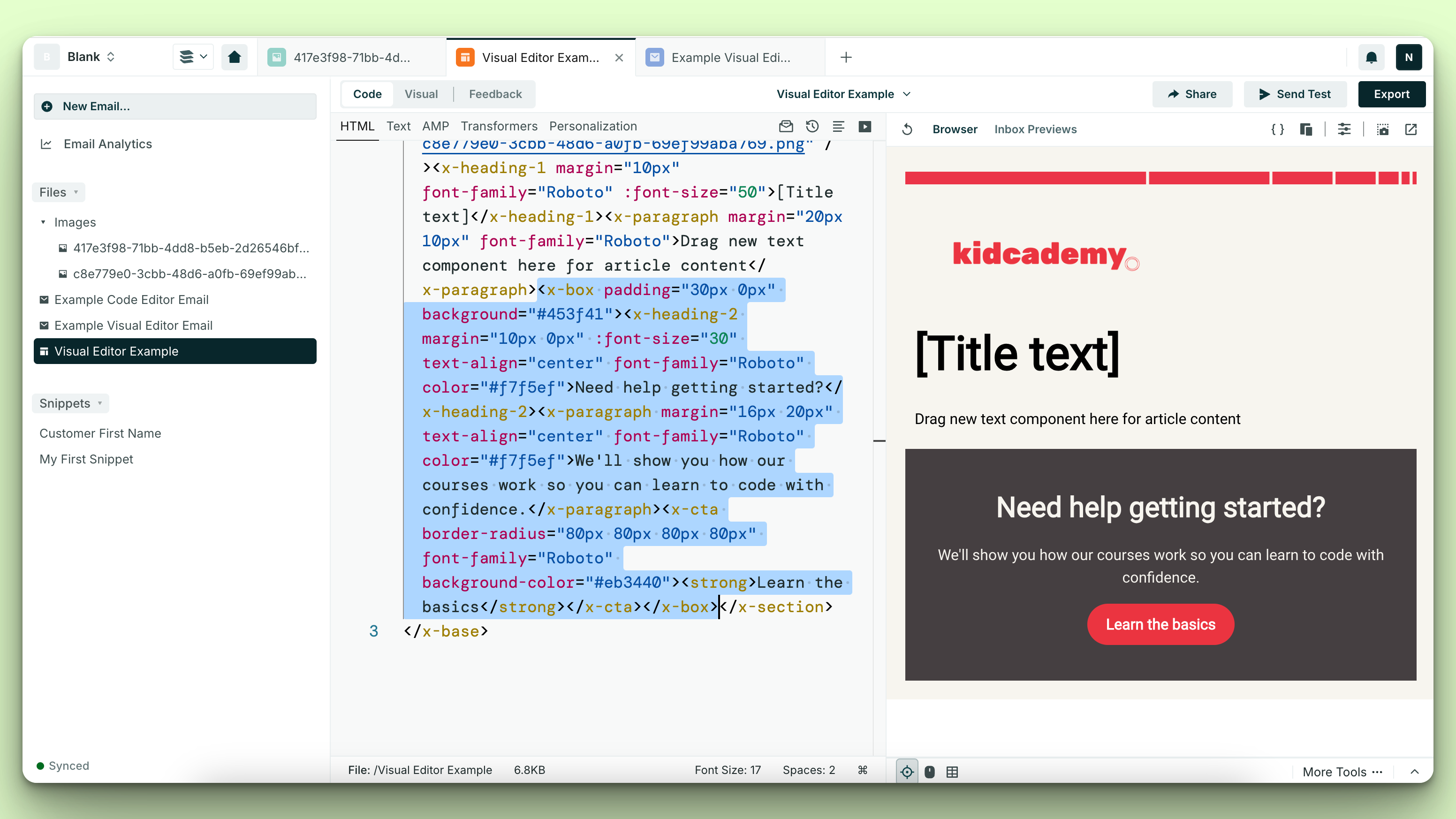
Switch to the code editor.
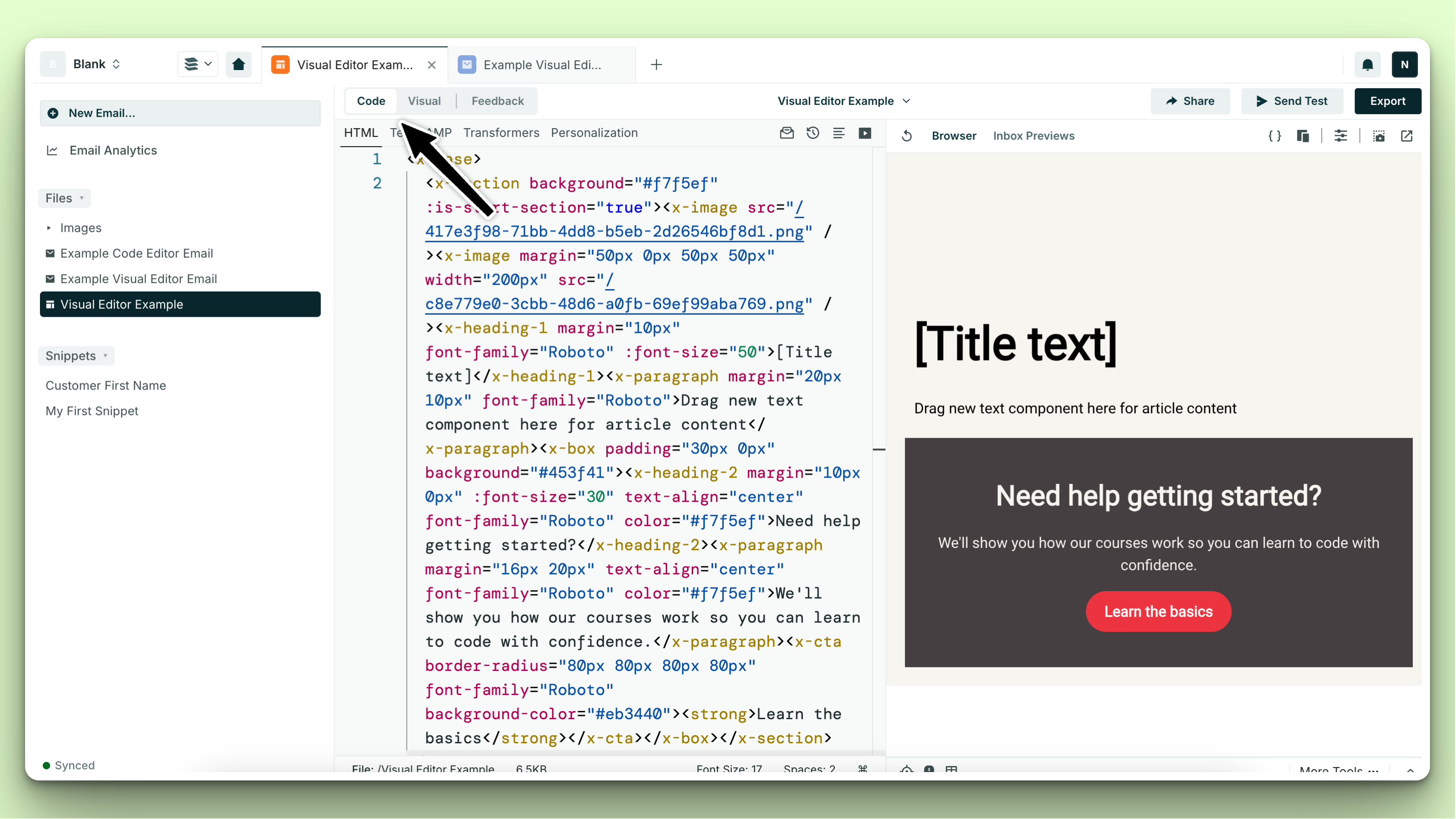
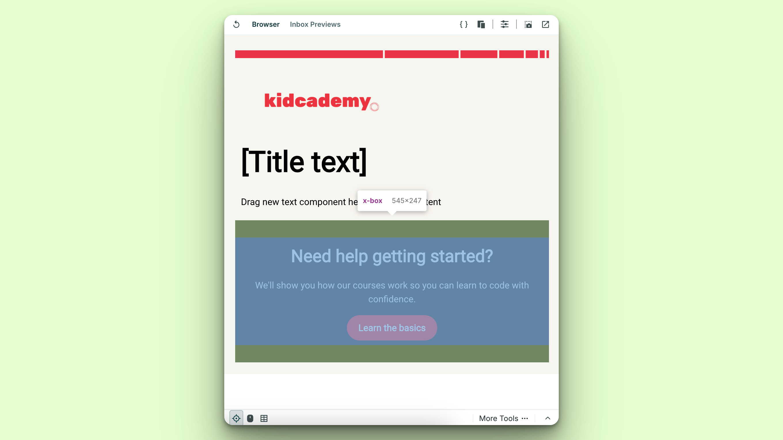
In the bottom left of your preview, use inspect mode to highlight the section we want to grab the code of.
Take the code that has now been highlighted in the code editor, and get ready to create your first component!
A custom component is a reusable module of content that you can control from one location, but use across multiple emails!
When you create a custom component, you’ll paste your highlighted code we isolated above, in between the opening and closing <slot> tags.
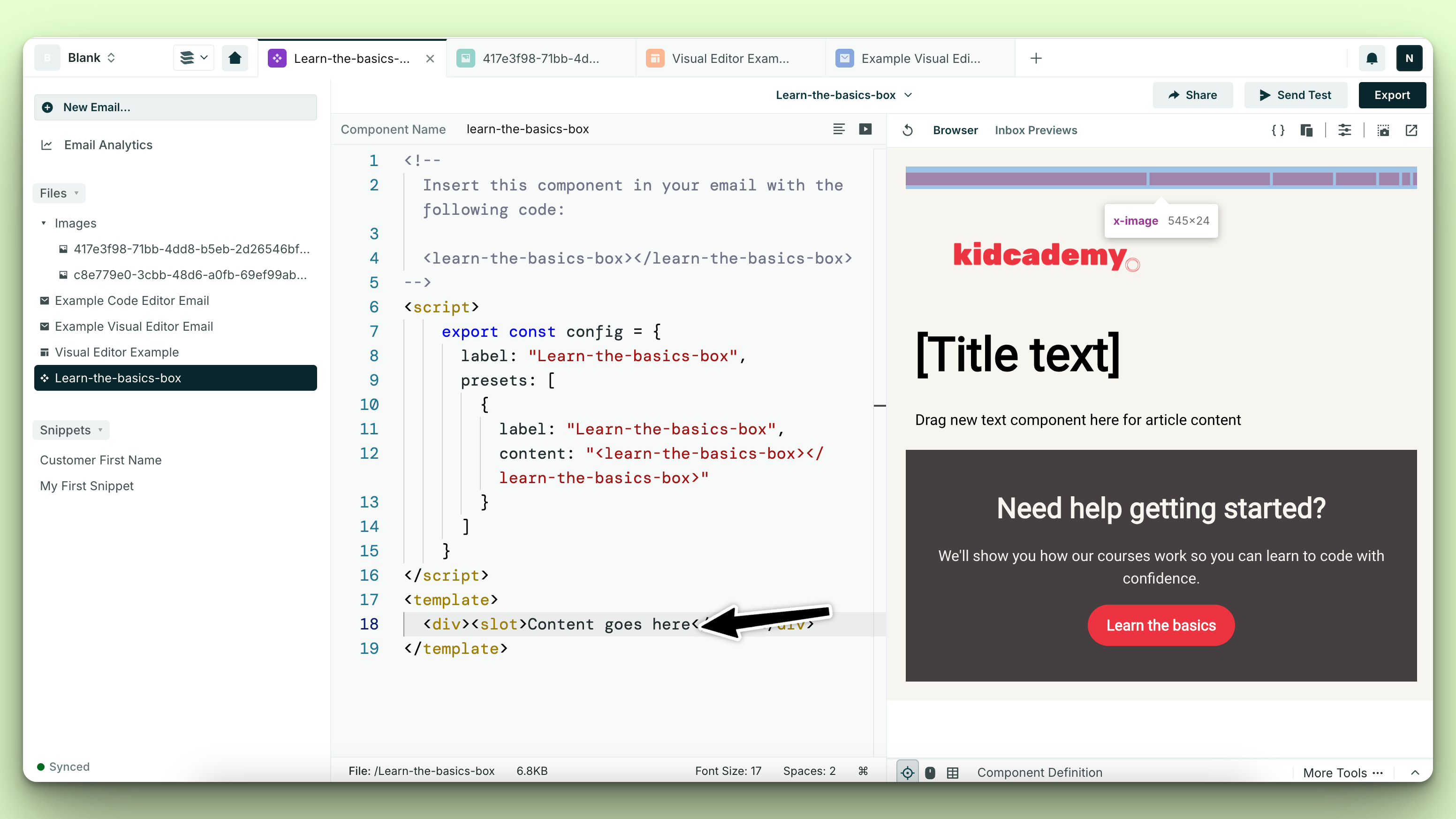
Now, we have a custom component that we can use in our next email!
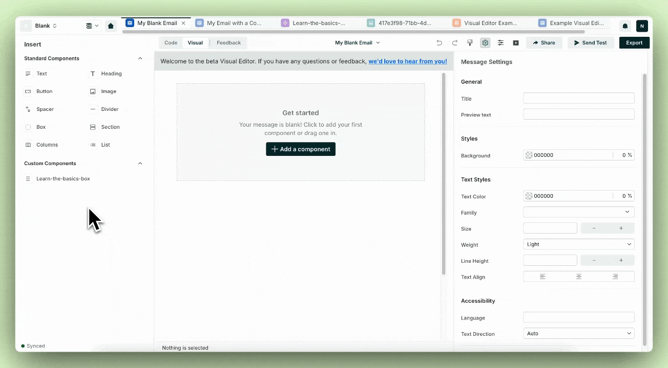
You can repeat this process for multiple content pieces, make them editable in the Visual Editor, add labels for organization purposes, and more. For additional information on how to use custom components, check out our documentation.
In the future, we’re excited to bring the ability to easily save custom components from the Visual Editor, and save your styling at a high level. Stay tuned for future releases of these!