Guide to dark mode
Dark mode is a design rendering created for low-light environments. It’s characterized by its color inversion, which many claims is easier on their eyes.
When it comes to dark mode in email, there are large inconsistencies between the top email clients, making it challenging to design and optimize.
We recommend working with dark mode, as opposed to working against it. As dark mode is most likely an individual user preference (ie. the user decides if they want to have dark mode enabled or not), there is no way to “hack” a workaround to make your emails skip inversion. There are opportunities for you to include a media query in your email code that give you control over a dark mode theme should it be enabled, but not all email clients will respect it. Some email clients allow for hacks to get a little control and some don’t allow any control.
There are three main ways dark mode may impact your designs. In this guide, we’ll review the different ways your email can change with dark mode, as well as outline how you can target these clients to ensure that your dark mode offerings are accessible and aligned to user preferences as best as they can be.
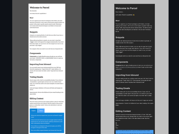
Before we begin, we will preface that you do not need to have a device or email account with all of these email clients to check how dark mode individually impacts your design. Parcel offers a free dark mode emulator, and with Inbox Previews, you can run email renderings of your designs with dark mode enabled before you hit send. Additionally, Parcel Analytics gives you insights into the dark mode breakdown of your subscribers.
Dark mode can impact your email design and cause accessibility issues. If your email is inaccessible (i.e. a subscriber can’t ingest its content), your business runs the risk of losing out on engagement and, further down the funnel, revenue. Like any pre-send QA, an email creator should take time to ensure that potential dark mode issues do not impact email content.
Wouldn’t it be nice if there was only one version of “dark mode” — an email developer can dream!
We can categorize the impact of dark mode into three buckets. Full-color inversion, partial inversion, and no change at all. It’s important to be aware of all three of these.
Some clients will fully invert your email designs. This includes:
- Changing font colors
- Changing background colors
- Gmail app (iOS)
- Office 365 (Windows) - this is exclusive to desktop, and not webmail.
- Outlook 2021 (Windows)
- Windows Mail
Because both font color and background color change, you’ll want to ensure your text is still legible when dark mode is enabled. We recommend reviewing the color contrast values you include in your designs and ensure when they invert, so your text does not disappear with the background.
Partial color inversion occurs when only portions of your email invert. This includes:
- Light backgrounds changing to dark
- Dark text becomes light
You may be thinking, that sounds like a full-color inversion. With partial color inversion, dark mode will likely not alter dark backgrounds (just light ones).
Who does this?
- Outlook.com
- Plain text emails (that’s right, all email clients will impact plain text emails with a partial color inversion)
What to watch out for?
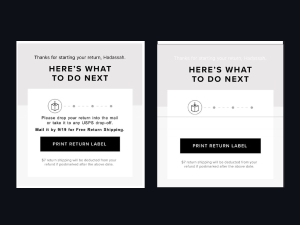
Let’s say you have an email that uses background images. Against a light background image, you have dark-text color. When a partial inversion occurs, this dark text inverts to light, and against the light background image, the text is now unreadable.
When it comes to partial inversions, you need to watch out for how images and fonts play with one another. If you are stacking text against images, you may be in for trouble.
Outlook.com
When Outlook.com converts colors it will add an attribute to the code. When it converts a color it will add data-ogsc when it converts background-color it will add data-ogsb we can then target these attributes to add our own styles. However, any colors added in our styles will also be converted.
<style>
/* targets color attribute */
[data-ogsc] .fubar {}

/* targets background attribute */
[data-ogsb] .fubar {}
</style>A handful of other images don’t have any changes when it comes to dark mode. Regardless of dark mode being enabled on the user's device, these clients won’t change your email design:
- Apple Mail
- AOL
- Gmail Desktop
- Yahoo mail
Optimizing for dark mode can range from a few easy checklist items to tick off and larger-scale improvements that will require more of your time. The best way to deal with email clients changing your colors is to design with that in mind. If the design is flexible enough to allow for forced dark mode, we only need to consider adding enhancements rather than fixes.
If you have a logo that is black against a white background, or white against a black background it might run the risk of disappearing when a full or partial inversion occurs. You can safeguard this by creating a logo with a contrasting outline. When the background color inverts, your logo will remain visible.
If you would like to work with the user preferences and target email clients to with styling that is more dark mode appropriate than the default inversion, we recommend you use this query to control the styling:
@media (prefers-color-scheme: dark){

}Some email clients will invert the text but not the background image; this can lead to the text being unreadable.
When email clients invert the text and background colors, it can sometimes result in a drop in contrast ratio. If you start with a very high contrast, this drop shouldn’t matter so much. Avoid mid-tones in colors
Mid tones can get muddy when inverted; light and dark tones tend to work better Use black and white designs
Black will invert to white and white will invert to black. This keeps things simple and will help keep colors closer to brand guidelines as most include both black and white. Saturated colour can be much more unpredictable and vary between email clients. Consider the transparency of images
Sometime you can use transparency to your advantage, allowing an image to blend into the background colour no matter how that color changes.
Sometimes you need to work around transparency, you may want your image to stand out against the background rather than blend in. Here it’s good to add a stroke around the image or maybe add a background colour. Also that background colour doesn’t have to cover the whole background, you could use a circle background and get the image to stand out while still keeping some transparency.
How can you check dark-mode renderings?
If you have optimized for dark mode and are targeting specific email clients with the media query referenced above, you can change the color scheme between System, Light mode, and Dark mode to preview your email.
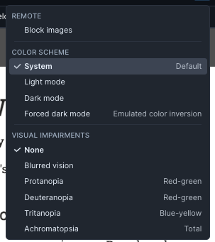
If you want to emulate color inversion, select this from one of Parcel’s preview controls. Whether you have media queries present or not, this will force a full-color inversion.
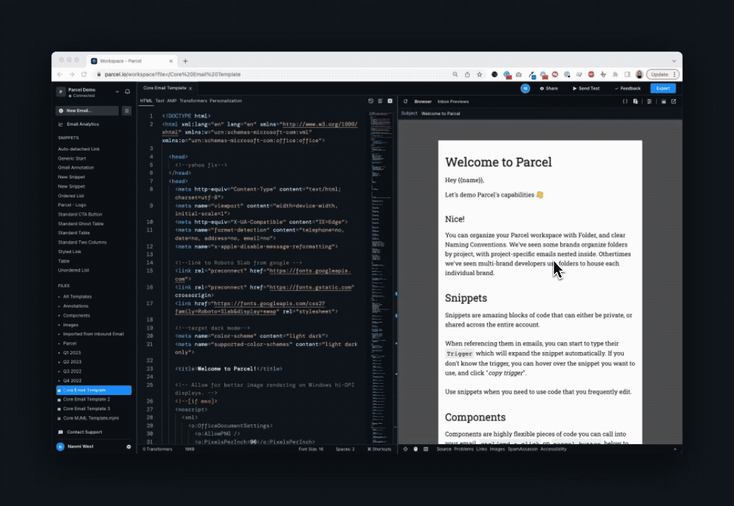
Parcel Inbox Previews enable you to preview your email design on live devices. You can select from multiple email clients and devices to understand the impact of dark mode, and adjust any issues that may arise!
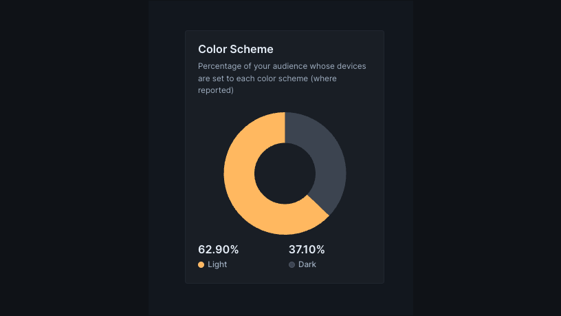
Parcel Analytics offers you a view into the preferences of your subscribers. Reporting on the breakdown between light and dark mode, you can understand the color scheme preferences of your subscribers.
Dark mode, without a doubt, is something to invest time into understanding.
Apple Mail
Apple Mail’s dark mode algorithm will invert:
#000000for you, regardless of what you are doing or not doing with dark mode specific CSS. Same thing applies to using:
#ffffffChanging both of those to something just barely different (such as #000000 to #000001, and #ffffff to #fffffe) avoids this issue.
Hiding images
Remember that scenario we described for partial inversions where dark mode caused your font to disappear against a background image? In this case, you may be interested in removing background images to avoid that.avoids this issue.
    <style>
    .dark-img { display: none !important; }

    @media (prefers-color-scheme: dark) {
      .dark-img {
        display: block !important;
      }

      .light-img {
        display: none !important;
      }
    }

    [data-ogsc] .dark-img {
      display: block !important;
    }

    [data-ogsc] .light-img {
      display: none !important;
    }
  </style>

  <!--HTML-->
  <a href=""><img class="light-img" src="https://via.placeholder.com/600x300" width="600" height="300" alt="" style="width: 100%; max-width: 600px; height: auto;" border="0" />
  <!--[if !mso]><! -->
  <img class="dark-img" src="https://via.placeholder.com/600x300" width="600" height="300" alt="" style="width: 100%; max-width: 600px; height: auto;" border="0" />
<!--<![endif]--></a>While talking about dark mode, it’s also worth mentioning light mode.
If your design is dark by default you can offer a light version for users who prefer it. Just like how some users find light emails harder to read, other user find dark emails harder to read so it’s good to give these users a good experience too.
For light mode, there are currently no forced color changes which makes things easier for us. The only thing we have is the same prefers-color-scheme we use for dark mode but this time targeted to light.
@media (prefers-color-scheme: light){

}
Do you have questions about dark mode and coding emails for it? Drop us a line; we’d love to include more in this guide for others!