Emulated dark mode support

Dark mode can significantly change the design of your email. It’s difficult to predict across clients, some will partially invert colors, some might fully invert colors, and what might be a nice looking email in light mode could quickly turn into a stark contrast when in dark mode.
Previously, Parcel supported dark mode and light mode previewing by leaning on media queries within your email’s HTML. Now, Parcel also has the option to emulate dark mode support, so even if you don’t have specific queries in your HTML, you’ll be able to see a general preview of what your email might look like in the inbox of your subscriber (whether it’s at their 1 am, or they prefer the dark side around the clock).
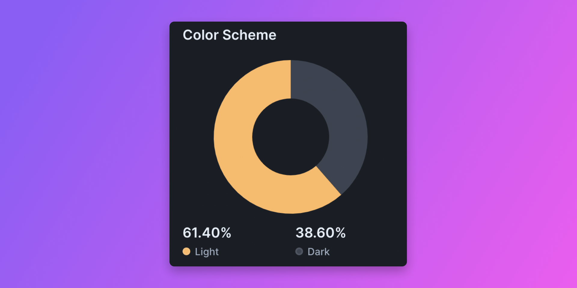
Should all marketers prepare for dark mode? It completely depends on your audience! If you have dabbled with Parcel Analytics, you can see a general audience breakdown of the light mode vs. dark mode split.

Regardless of the breakdown, it could be a good approach to preview your email with dark mode emulation and fix any major concerns that might pop up. We’ve seen scenarios where light text against a dark background might disappear when dark mode wreaks havoc on your email. We’d consider this an accessibility issue and advocate that it is 100% worth a design fix to correct.
Dark mode is a user preference and has been a great alternative for those wanting design that is easier on the eyes. Working around the intricacies of dark mode should be something we consider with empathy and in the user's best interest, which for brands with strict guidelines and color palettes, may feel limiting — we get it. But if a user wants a darker design experience, and you can create an email that caters to this AND is still accessible, we consider this an email win.
We hope that Parcel’s dark mode emulation support will give all email creators an easy route to simulate this experience, catch issues, and in turn, create an overall fantastic viewing and reading experience for all audiences at all times of the day.